As a still relatively new competition, we knew the Converge Challenge brand would benefit most from retaining its strong association with Heriot-Watt University at that time, allowing to take full advantage of the prestige and credibility the University brought. For that reason, we borrowed heavily from the look and feel of the University’s brand guidelines in 2013, utilising the diagonal shape and blue colour of the Heriot-Watt logo to develop a simple but striking brand identity and clear motivational messaging for all aspects of the competition. The result was compelling, simple, vibrant and professional, with a strong call to action, the spirit of which remains across Converge Challenge communications today.

As Converge Challenge grew over the years to include other Scottish universities, it became clear in 2014 that a rebrand was required, to reposition the competition’s association away from Heriot-Watt and make it more appealing and accessible. Morton Ward was again asked to help make this happen, taking the essence of the identity we had already created to evolve it in to something fresh and new – a strong, independent Converge Challenge for all university audiences.
To do this, we developed a new identity and campaign style around four key components: a strong, flexible stand-alone logo that could change to reflect the year; a bold colour palette; single iconic images; and clear, simple headlines, all combined to create high impact, highly recognisable visuals that could be applied across all the various marketing and promotional materials that Converge Challenge required.
The results were dramatic, with a year one increase in applications after the rebrand of 86% and continued growth each subsequent year!

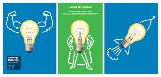
Great branding doesn’t stand still, so for 2017 Morton Ward worked with the team at Converge to evolve the look and feel. While the basics remain in place to ensure recognition and consistency (the cornerstone of great branding), we all wanted to make greater use of our favourite hero image – the light bulb – and add some bright new colours to denote specific areas of interest within the competition. As a classic representation of ideas and eureka moments, we adapted the light bulb to illustrate aspects of the programme through a series of fun, imaginative graphics that engage readers and make them think. You may have seen some of these already, but there are more to come!
Converge is all about stimulating ideas and encouraging people to innovate beyond the usual.
We’ve tried to capture and evolve this essence over the years through our branding and communications work for Converge Challenge, and we hope you like it!
No matter what your industry, product, service or market, a strong brand provides focus that aids development; recognition that propels growth and differentiation that cannot be duplicated by competitors. If you would like to talk more about your branding, Morton Ward would love to hear from you.
Check out our work at www.mortonward.co.uk, call us on 0131 555 3553 or email ewan@mortonward.co.uk.


